
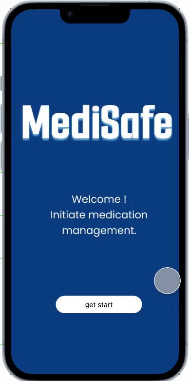
MediSafe
An Elderly Medication Manager
Why I create this APP?
Globally, a large number of chronic disease patients require long-term, consistent medication adherence, yet actual compliance rates remain low—compromising health outcomes and driving up healthcare costs.Medisafe will “eliminate management” from traditional reminder devices, elevating Huawei into a digital, automated, and sustainable health partner.It addresses more than mere “reminders,” serving as a comprehensive “health behavior support system” centered on the patient's entire lifecycle.
Skills User Interviews, Competitive Research, Affinity Mapping, Personas, Journey Map, User flow, UI Design, Usability Testing
Duration 2 months
Project Type A individual Design project
Tools Figma, photoshop
Project Overview
Medisafe is a digital health platform dedicated to improving patient medication adherence and treatment outcomes. Through smart reminders, behavioral science, and AI-driven personalized interventions, it enables patients to take their medications on time and accurately, thereby enhancing health outcomes and reducing healthcare waste.
My design progress
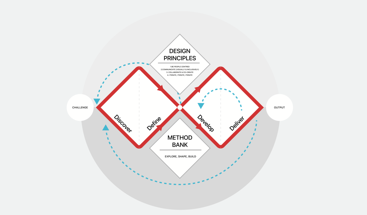
Discover
Primary Research
The project's inception stemmed not from a simple functional survey, but from keen observations of the daily lives of elderly family members. I discovered that medication challenges for seniors represent a systemic issue intertwining physical, psychological, and cognitive factors.
I interviewed six participants aged 52 to 76 who also experienced medication forgetfulness and were unfamiliar with smart devices. The goal of the interviews was to determine their medical histories, the types of medications they needed to take, the kind of reminders they required, and their usual medication-taking habits.
According to the survey, existing applications focus primarily on basic scheduling and recording functions rather than medication safety. Their reminder features are limited to one-time or weak prompts, lacking continuous confirmation mechanisms. The content is often overly complex, creating barriers for elderly users. Family collaboration and remote monitoring capabilities are similarly constrained.
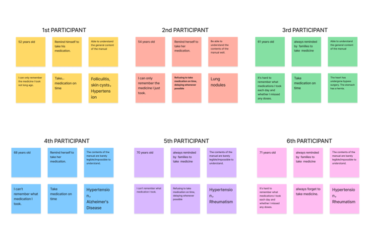
After the interviews, I used an affinity map to sort my findings into five key categories that reflect users’ pain points:
Physiological Barriers: As they age, declining vision renders the fine print on medication labels indecipherable, while hearing loss makes ordinary phone ringtones difficult to detect.
Psychological Dynamics: Interviews reveal that many seniors exhibit a strong “self-respect preservation” mentality. They hesitate to disturb their busy children over missed doses, and this shame of “not wanting to be a burden” leads them to choose self-imposed silence over excessive supervision.
Cognitive burden: Living with multiple coexisting conditions means managing several—or even a dozen—medications simultaneously. Complex dosage and frequency calculations push beyond their cognitive comfort zone.
Secondary Research
Why did the existing solution fail?
I selected the three apps with the highest ratings and most users on the App Store and analyzed their core value propositions along with their strengths and weaknesses.
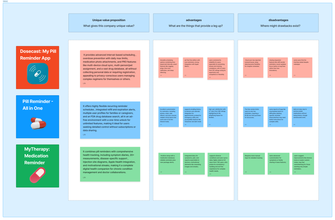
During my secondary research, I analyzed the top three highest-rated competitors in the market. While they offer flexible scheduling and database support, they suffer from three critical shortcomings in addressing the core pain points of the elderly:
Feature overload: Existing apps are packed with numerous recording and reporting functions, but their complex hierarchical logic creates significant cognitive barriers for seniors.
Weakness of passive reminders: Most reminders are one-time notifications lacking a “continuous confirmation mechanism” tailored to seniors' forgetfulness. Even when seniors hear the alert, they may forget again due to momentary distractions.
Lack of Emotional Connection: Product design often adopts a “supervisor” perspective rather than a “user” perspective, failing to respect the dignity of seniors as independent individuals.
Based on the initial survey, I realized that older adults' “digital exclusion” stems from a fear of operational failure and a heightened sensitivity to dignity. While the features provided by Secondary Research are “robust,” they come across as “cold.” Therefore, we need to explore a more human-centered technological intervention solution moving forward.
Define
User Persona
Mr. Wei's “Non-Typical” Daily Routine
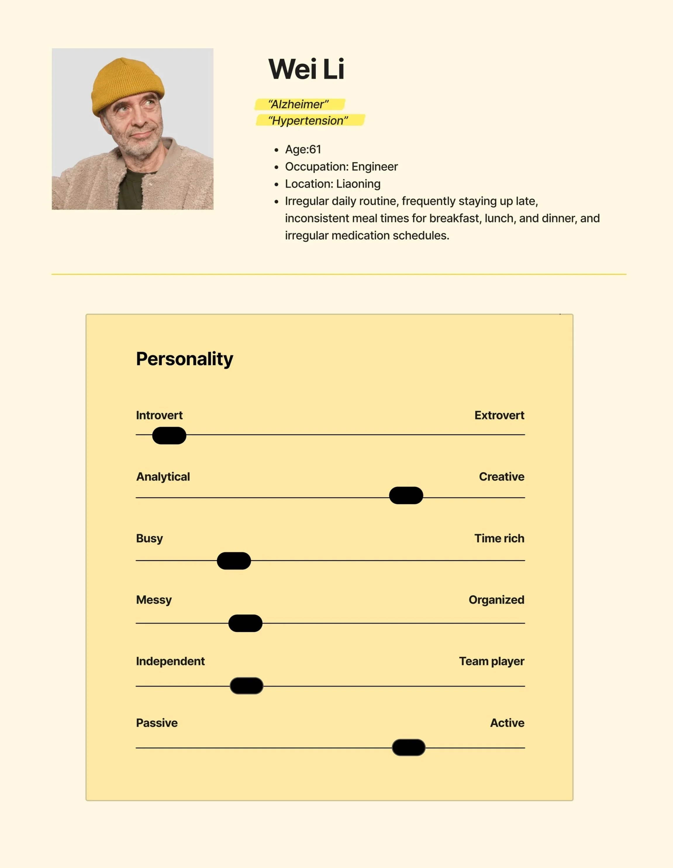
We're not merely designing a medication list or pill reminder alarm—we're creating an assistive system for a person with social connections, dignity, and a life rhythm.
Behaviors
Mr. Li have been smoking for about 20 years and occasionally drink alcohol. He enjoys playing cards and chess with peers in the park, sometimes skipping lunch. These unhealthy lifestyle habits have led him to develop hypertension and other chronic diseases.
Frustrations
Fed up with children constantly reminding and monitoring their medication intake, feeling their dignity has been violated.
He often forgets whether he has already taken this medication when he picks it up.
His vision and hearing have deteriorated, making it difficult for him to read medication labels and understand the drug's effects and dosage schedule.
Goals
He wants a medication reminder system that could flexibly adapt to his irregular lifestyle.
He wants a simple process for entering medication information.
He wants to know his medication history and timestamps.
At 67, retired engineer Mr. Wei maintains an active social life (playing chess, cards), where this “irregularity” fuels his later-life joy yet poses a significant challenge for medication management. His greatest fear isn't illness itself, but the sense of “losing control”—the helplessness of blurred labels, the self-doubt of forgetting whether he's taken his medicine, and the dignity eroded by being “monitored” by his children as if he were a child.
Age-friendly design should not be a crippleware of complex systems, but rather an “invisible and adaptive” system. It needs to accommodate Mr. Wei's irregular social life, not force him to give up chess to take his medication.
Whose problems am I solving for?
People:
who with memory loss.
who taking multiple medications that may interact with each other.
who concerned about taking the wrong medication when their guardian is not present.
who with poor eyesight who cannot clearly read medication labels and wish to understand the drug information.
who procrastinate and keep putting off taking their medication.
Painpoints:
The variety of medications is extensive and complex.
The instruction manual is hard to understand.
Don't want to bother others to remind .
Dislike being overly supervised by my family.
Difficult to trace medication records.
All research ultimately converges on one core question: “How can we leverage technology to enable older adults to manage multiple medications with ease, accuracy, and autonomy—without compromising their quality of life or dignity?”
Problem Statement
Everything starts from a complaint that I heard a lot from my grandparents “Why do I always forget to take my medicine?”
So, the problem I am trying to solve is:
How might We make older people easier to take their medication?
Ideation
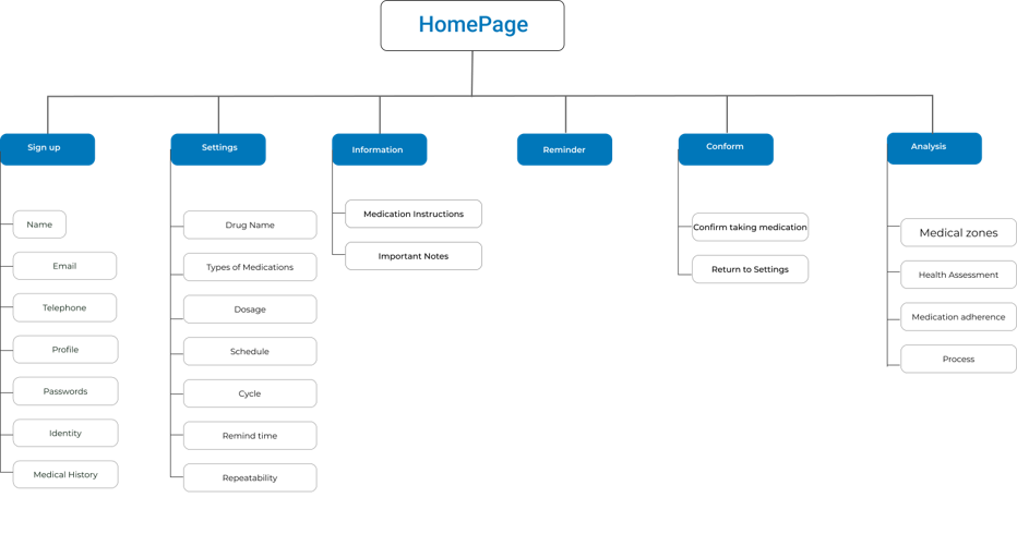
Site Map
Using affinity mapping, user stories were created. These users’ stories help me identify the main screens users would like to access first to begin their user journey.
User Scenario
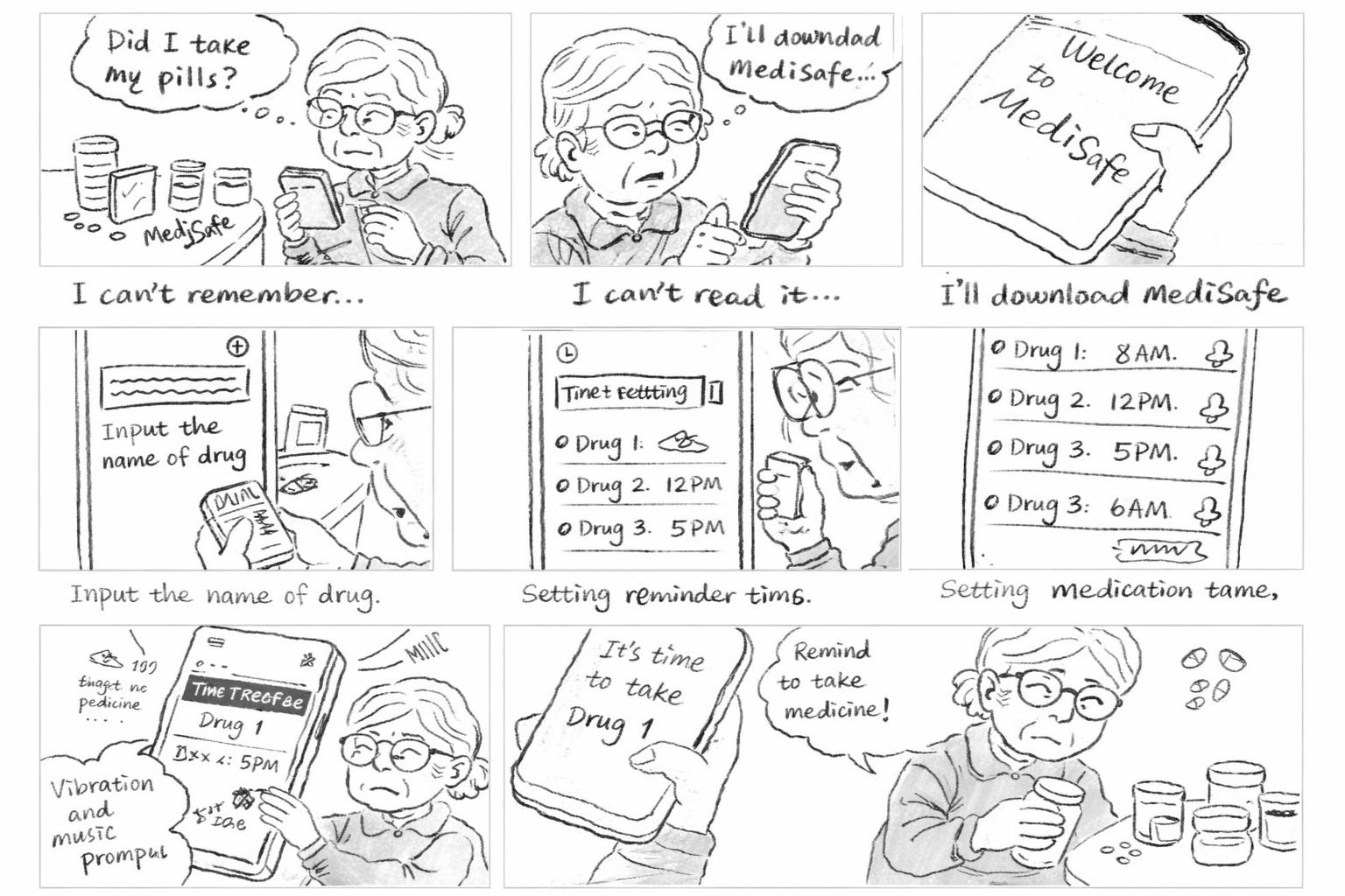
Scenario1: Zhang's presbyopia made it hard for her to read the instructions, and her declining memory made it difficult for her to remember when to take which medication.
Scenario2: She set up the medication information, times, and reminder methods.
Scenario3:The phone lock screen alert combined with the ringtone and vibration provided dual reminders, prompting Zhang to take his medication promptly upon receiving the notification.
Sketches
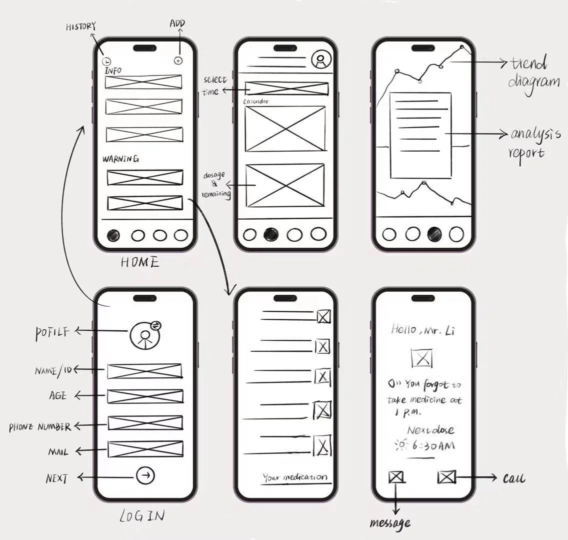
Flow1: Set user identity.
Flow2: Input medication information and reminder time.
Flow3: View Medication Dependency Analysis。
Low-fidelity wireframes
Flow1: Create an account and set user identity.
Flow2: Enter medication information, set reminder times and methods, and provide an option to confirm medication intake after the reminder is triggered.
Flow3: View Medication Dependency Analysis。
Guerilla Testings
I conducted four remote tests via the Tencent Meeting platform. I specifically selected participants from the target user group, including several individuals who had previously been interviewed by me. This testing aimed to validate the application's usability and functionality. I designed a series of task lists requiring users to complete corresponding actions while navigating the interface independently. Before initiating each process, I provided them with specific prompts and contextual scenarios.
Feedback
During the first round of usability testing, I identified a critical logical flaw: the disconnect between data entry and scheduling.
In the initial design, AR scanning of medications and setting reminder times were two separate processes. Elderly users reported: “I just finished scanning—why do I have to go somewhere else to set the time?”
For users with declining cognitive abilities, “step-by-step operations” are the enemy of memory retention. Any transition between functions causes them to forget their current task progress.
I restructured the interaction flow, merging “scan recognition” and “time setting” into a single linear flow. Upon completing the scan, the system automatically displays suggested times, requiring only a single tap for confirmation.
The usability of each interface is satisfactory, but users struggle to grasp the app's core functionality due to the absence of several crucial additional features.
Typing medication information is inconvenient for seniors with presbyopia. We recommend switching to AR scanning of medication packaging or scanning appointment slips for data entry.
Changing the app's color scheme improved visibility, as the original model colors lacked contrast and were difficult to distinguish.
Delete complex drug information presentation to reduce cognitive burden for seniors, stating drug efficacy and administration methods in concise language.
Based on post-testing feedback, I began reflecting and realized that medication adherence for seniors requires more than just strong reminders. It also demands high-contrast interfaces for visual clarity, intelligent mechanisms that adapt to individual schedules, and clear tracking records.
Develop
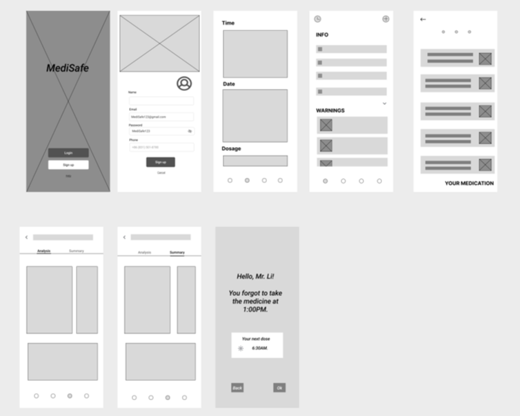
High-fidelity prototype
Before diving into the specific design, my initial question was: If existing apps already solve the “alarm clock” problem, why do seniors still struggle to adhere to their medication schedules? By analyzing the “breakpoints” in the user journey, I identified three key propositions to anchor my conceptualization:
How can we eliminate the “input anxiety” caused by presbyopia and cognitive burden?
How can we provide certainty to eliminate the anxiety of “Have I already taken this?” when seniors pick up their pill bottles?
How can we maintain seniors' sense of independence and self-respect while ensuring safety oversight?
Key features
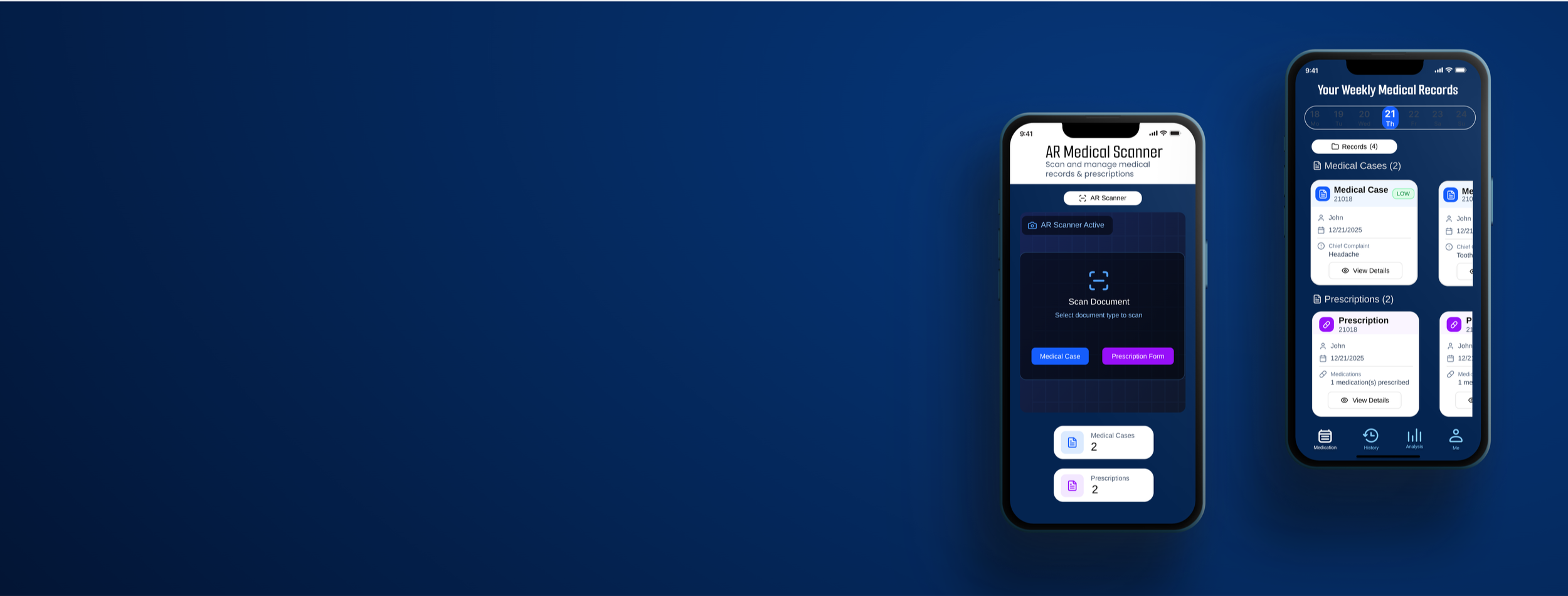
Flow1
Register and select user identity.
Flow2
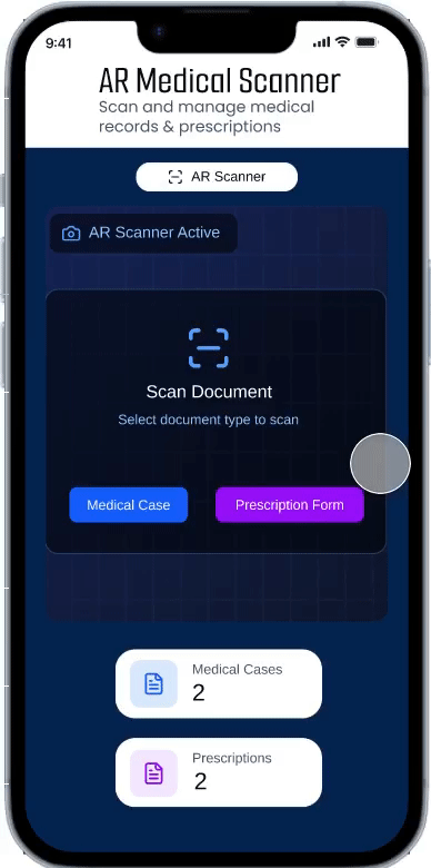
Scan the medication box or prescription to input the drug information (since mobile screens are small, and the text on medication boxes, instructions, and prescriptions is tiny, making it hard for seniors to read; scanning avoids the need for manual data entry).
Why AR Scanning Over Alternatives?
When conceptualizing information input methods, I evaluated multiple approaches:
Manual Input: Proven extremely inefficient and error-prone in preliminary testing.
Voice Input: Though fast, accuracy suffers in noisy environments and struggles with complex chemical drug names.
AR Scanning (Final Choice): Medicine boxes, instructions, and registration slips are the physical media most familiar to seniors. AR scanning directly converts “physical actions” into “digital information,” not only bypassing typing difficulties but also leveraging the phone camera as a “second pair of eyes” to identify tiny text for them.
The best age-friendly technology doesn't require seniors to learn new skills; instead, it digitally enhances actions they already know, like “checking their pill bottles.”
Flow3
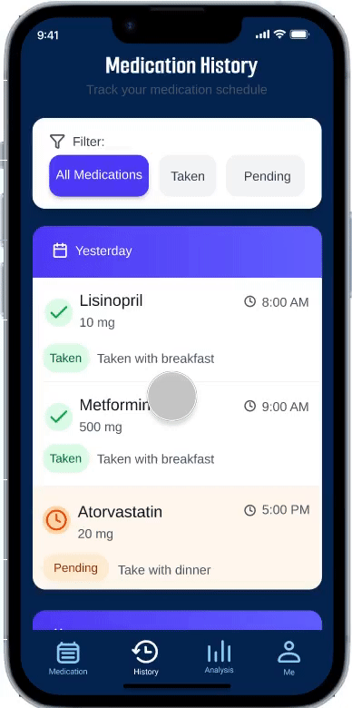
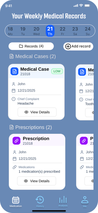
Medications you've taken will display a timestamp to confirm you've taken them, preventing duplicate doses. Unadministered medications will appear in a different color, and taken and untaken medications will be separated using a filter.
Flow4
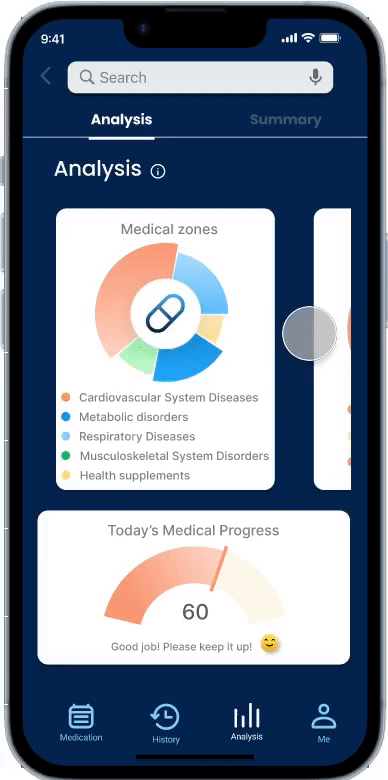
After taking medication, review medication adherence analysis to monitor users' medication compliance.
Flow5
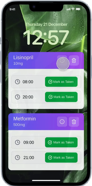
Pop-up notifications + audio alerts allow you to view medication details and mark the medication as taken after consumption.
Research revealed that overly complex instructions are the primary reason seniors abandon reading. During the conceptual phase, I established the principle of “core information first”:
Remove esoteric pharmacological analyses, retaining only: dosage, administration method, and contraindications.
Employed high-contrast colors and large fonts to ensure users grasp critical instructions instantly.
Addressing participants' “forgetfulness and procrastination,” I designed a three-pronged feedback system:
Lock-screen pop-ups combined with audible/vibrating alerts ensure care reminders aren't missed.
Physical Check-in Sensation: Seniors must tap to confirm after medication, generating a clear timestamp.
Distinct colors differentiate “Taken” from “Pending,” using visual “completion cues” to provide clear psychological reinforcement: “I've safely completed this task.”
Test and Iteration
Second round User testing on final version of hi-fi prototype
To truly validate design feasibility from the user's perspective, I conducted five user testing interviews targeting elderly users with long-term medication needs. All test subjects were drawn from the same user group identified in the initial round of interviews. All tests were conducted remotely via Tencent Meeting, requiring users to share their screens and interact with the application using Figma prototype links. This testing aimed to comprehensively identify usability issues while refining feature positioning and effectively meeting user needs.
Before
After
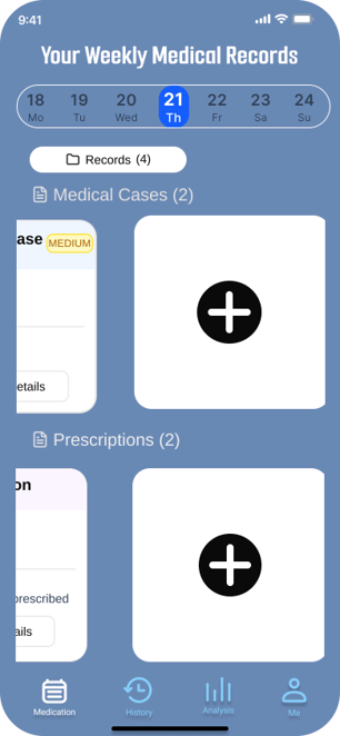
A major overhaul of the app's main interface. The initial design's “Add” feature made it difficult for elderly users to see clearly, and the lack of separation between medication and diagnosis entries caused confusion during data entry. In the second version, I implemented larger card views to enable instant information retrieval. The “Add” icon was also placed prominently at the top of the card view to highlight the core functionality.
Although the current solution addresses the core pain points, at the end of testing, I discovered that seniors still feel uneasy about “emergencies”—such as going out or forgetting to bring their pill box. This led me to consider the next step: how to establish a more resilient “temporary fallback logic” rather than relying solely on fixed alarm reminders.
Takeaways
Don't just follow a rigid design process, as this can cause me to overlook the user experience. Instead, deeply consider the underlying purpose behind each step.
This was my first user experience project. When I first encountered user experience theory, I followed each step meticulously, believing that by strictly adhering to the theoretical process, the project would unfold exactly as I envisioned. It wasn't until I completed several tasks for the MediSafe app that I truly grasped the importance of a steadfast purpose. Without a fixed, unchanging purpose, the journey toward achieving it becomes fraught with wasted effort, squandered time and energy, and often yields unsatisfactory results. This project taught me to define clear objectives before starting any endeavor and to consistently strive toward them. Even when the journey is fraught with twists and turns—even if I get bogged down in minor details or take detours—I can continually adjust my course by referencing the ultimate goal.
Always think from the user's perspective; all application processes should be user-centered.
When creating initial sketches, I tend to arrogantly jump to conclusions and design overly simplified workflows, presuming that simplicity is best for elderly users. However, after actually speaking with seniors, I gained clarity on their genuine needs and emotions. I began to truly empathize with them and started designing the app from an elderly user's perspective. This project taught me never to be self-righteous or condescending, never to place myself above users' feelings. Instead, I must genuinely embrace their experiences and acknowledge their needs.