
NexusPet
One Calm Path Through a Crisis
Skills User Interviews, Competitive Research, Affinity Mapping, Personas, User Journey Map, Empathy mapping, User flow, UX Design, UI Design, Usability Testing
Duration 6 weeks
Role: UX designer
Project Type Personal UX designm
Tools photoshop, Figma, Tripo Studio
Project Overview
By designing an app, we help pet owners efficiently resolve issues and alleviate anxiety when their pets encounter emergencies. It also generates a lifelong health passport that records the pet's biometric information, medical history, and medication records.
Young people juggling demanding careers increasingly turn to pets for emotional healing and stress relief. In recent years, pet ownership rates have steadily climbed, with pets now regarded as full-fledged family members by the younger generation. However, existing apps addressing pet healthcare needs remain fragmented and indirect, forcing users to jump between different platforms to gather information—a highly inconvenient experience.
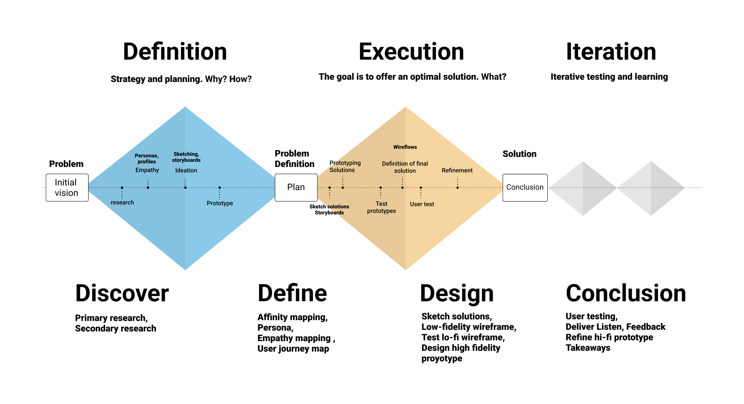
Discover
Secondary research
Positioning and Analysis of the Pet Market
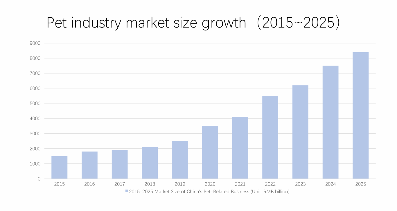
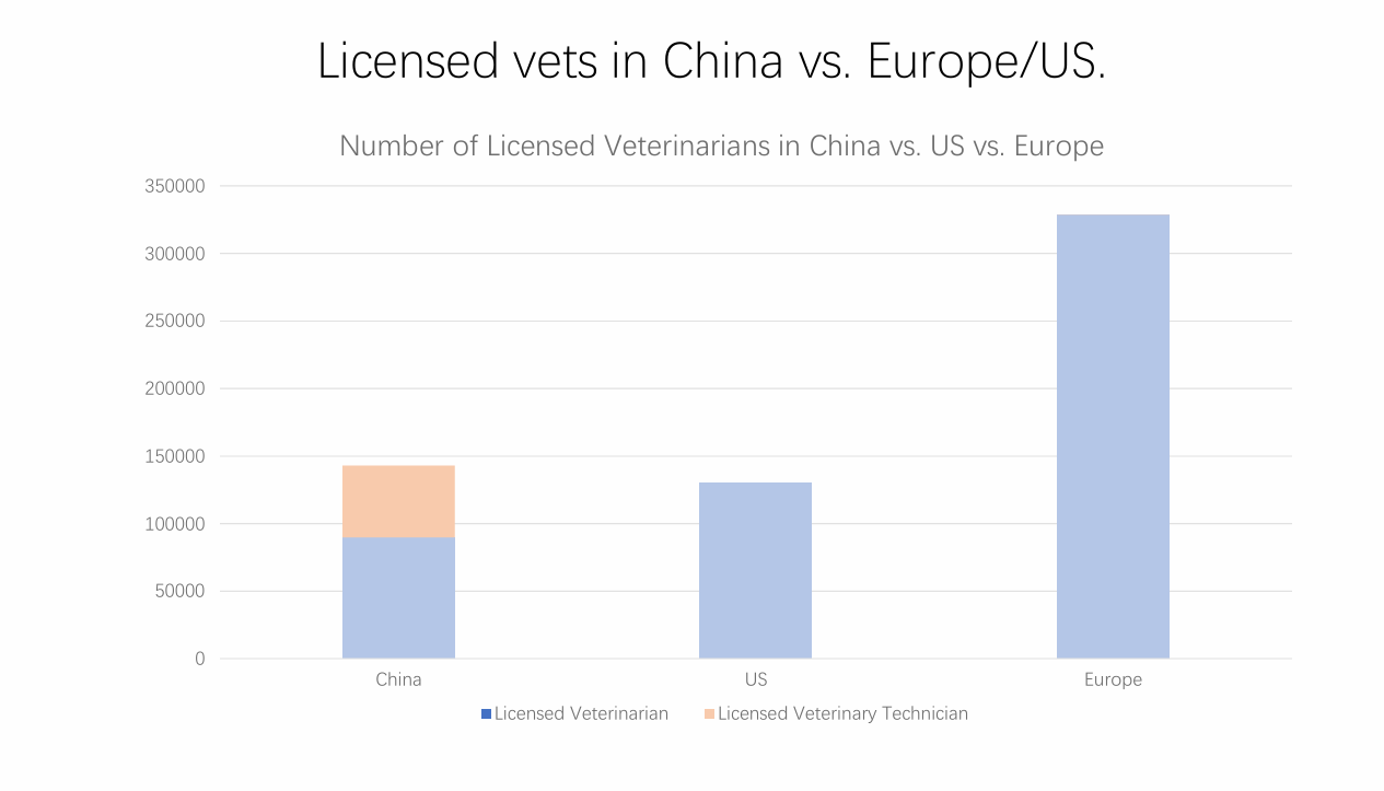
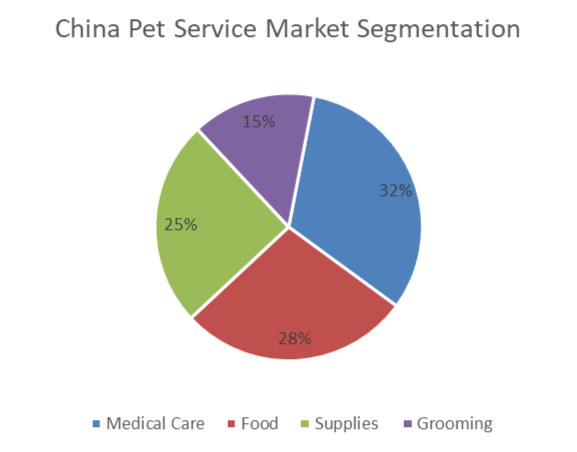
China’s pet industry is rapidly transitioning from a niche market to the mainstream, with market size expanding from RMB 97.8 billion in 2015 to an estimated RMB 811.4 billion by 2025 and projected to exceed RMB 1.15 trillion by 2028. Consumption upgrading has shifted spending toward services—particularly medical care (32%), followed by food (28%), supplies (25%), and beauty (15%)—as pet owners increasingly demand higher-quality food, smart products, and professional healthcare. However, this demand growth is constrained by a severe shortage of licensed veterinarians, with only about 5 vets per 10,000 pets compared to 15–20 in Western markets, creating a critical bottleneck in access to professional pet medical services.
Analysis of the Competitive Landscape
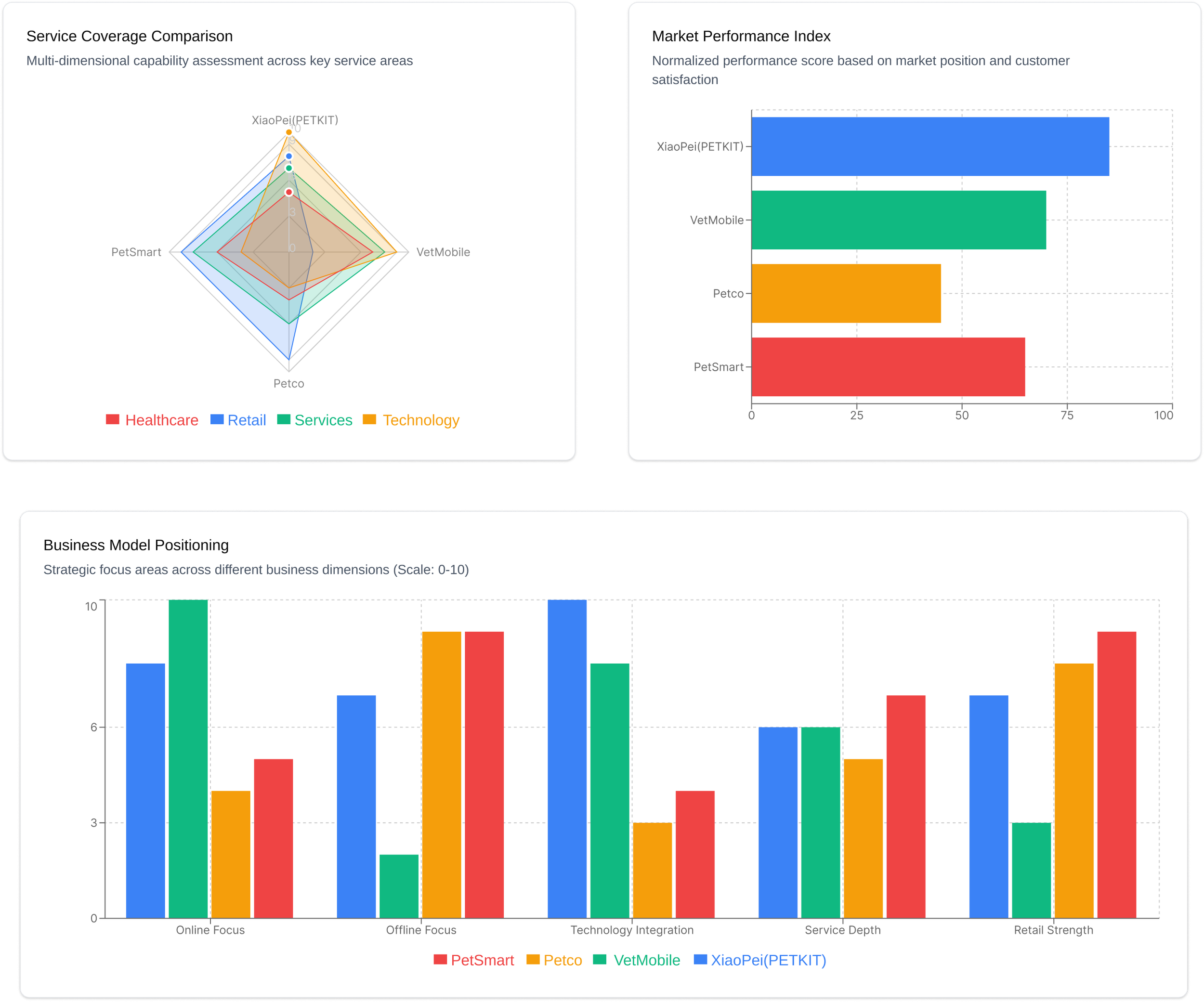
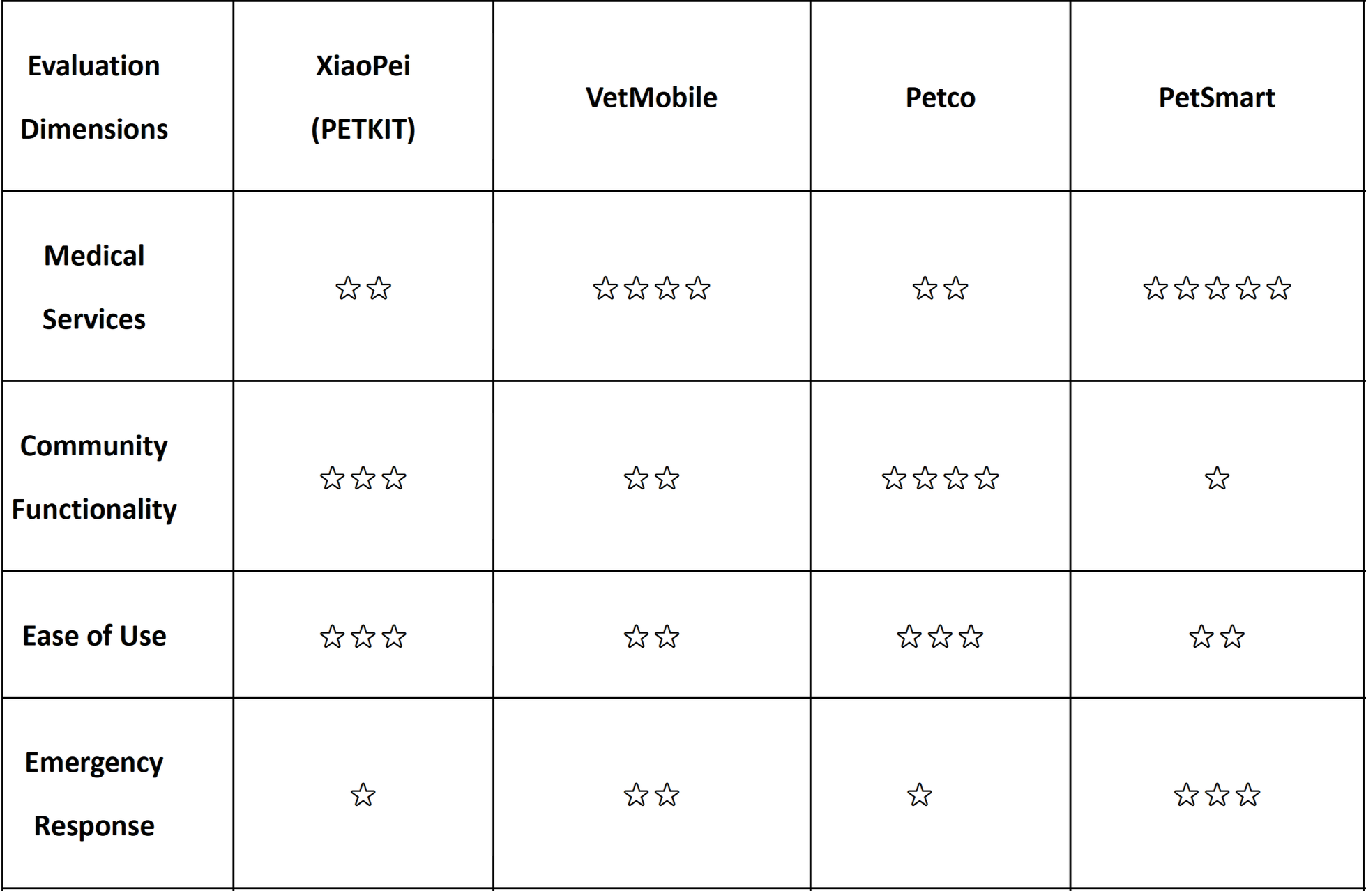
Overall, these four major brands represent three primary models in today's pet services market. Yet they all face a common challenge: the disconnect between online and offline services, leading to data silos and service gaps. This precisely highlights the future competitive edge and potential opportunities.
Existing problem-solving applications in the market
There are three existing apps that might solve the problem. They are from three categories: navigation, social media, traveling
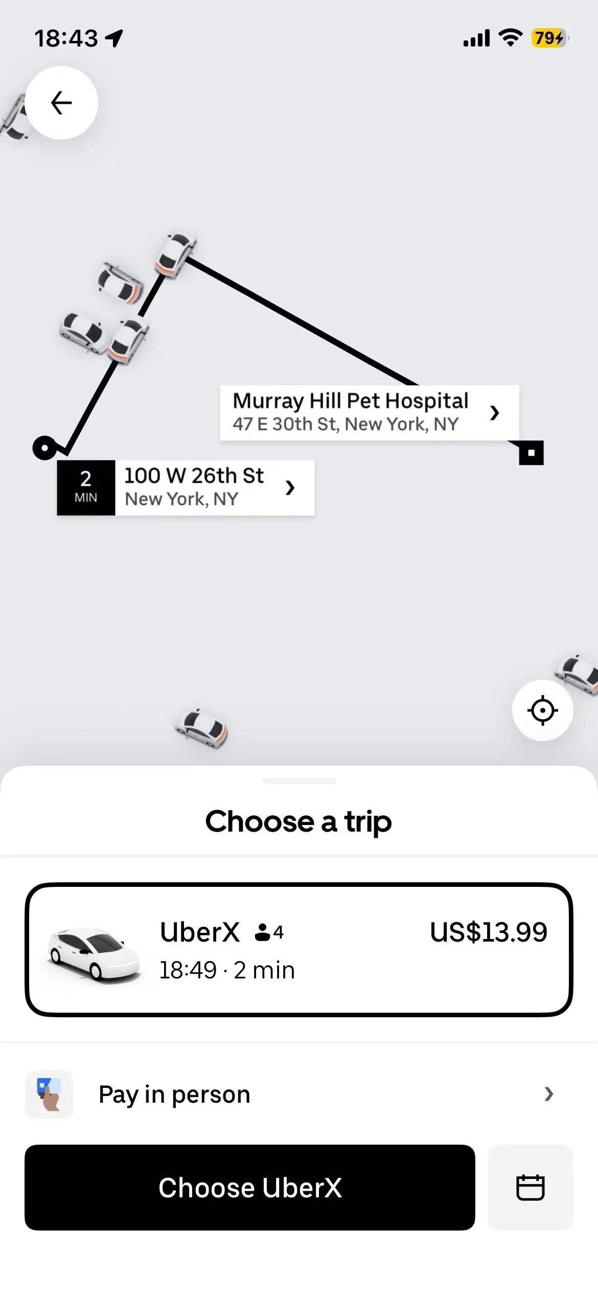


Google Map, Uber, Instagram
Google map does not show the details of pet hospital and lacks comments.
Uber focuses more on routes and transportation.
Instagram mainly targets sharing and discussion on pet care topics.
Based on the result of my secondary research, even though there are some tools in map navigating, and ride-hailing service, there is no app that provides a comprehensive pet healthcare ecosystem integrates three separate processes—diagnosis, hospital appointments, and transportation to the hospital—into a single, seamless workflow.
Especially when pets fall ill, pet owners are in a state of anxiety. Switching back and forth between multiple apps is prone to errors and wastes valuable time.
Why can't generic apps solve this pain point? Because amid extreme anxiety over a pet's illness, users need “shortened decision paths”—not just a pile of tools. Frequent app switching leads to information loss and poor decision-making.
Primary research
User interviews help me gather user insights and requirements, and understand their emotional needs.
I interviewed four participants with shared interests to explore their challenges when information becomes fragmented and experiences disjointed during their pets' illnesses. This interview aimed to investigate the root causes of their distress, their preferred decision-making styles, and their post-decision experiences.
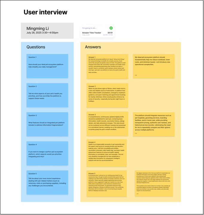
Content from one of the user interviews
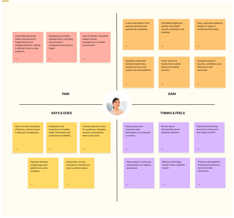
After the interviews, I used empathy map to sort my findings into three key categories that reflect users’ pain points.
I've discovered that the core pain point for users isn't “not being able to find a hospital,” but rather “being unable to determine which option is most reliable in panic.”
Define
Problem statement
Based on the low points identified in the User Journey Map, I formulated the core “How Might We” questions as the starting point for design:
How might we help pet owners find the most effective and reliable health management approach?
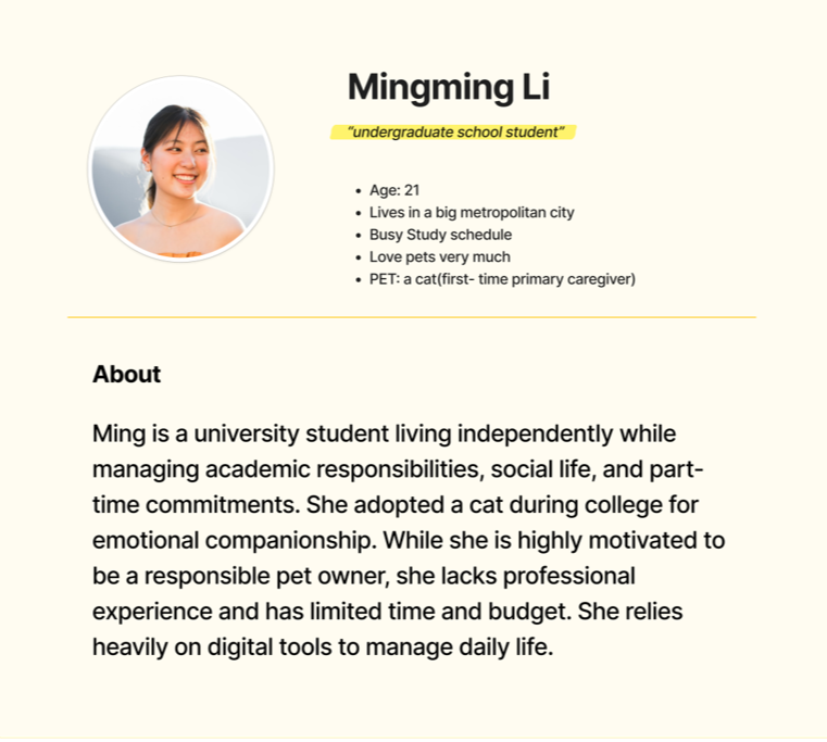
Persona
User Journey Map
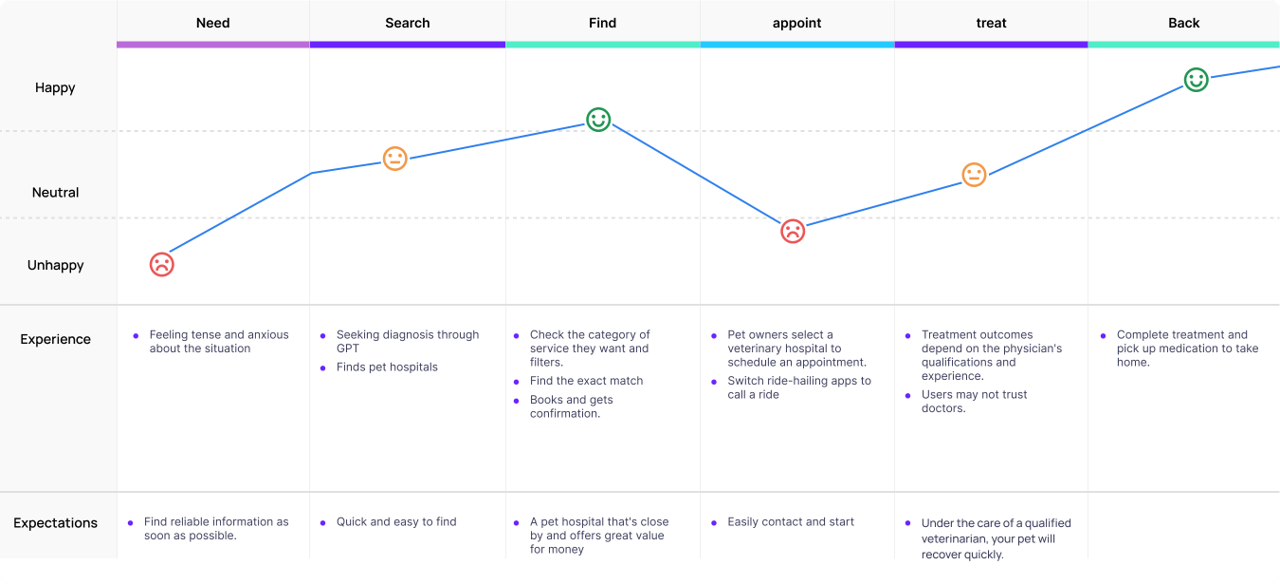
By mapping the user journey, I pinpointed the three stages where user sentiment is lowest: identifying the problem, searching for information, and scheduling an appointment.
Based on these emotional lows, I identified the following areas for improvement to better address pain points:
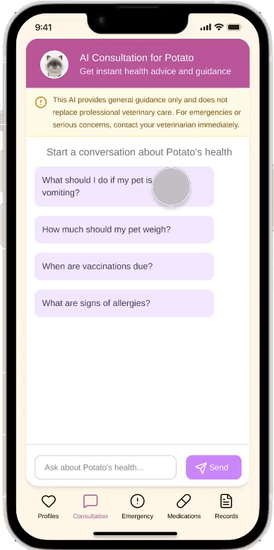
Opportunity A: Establish a “Pre-diagnosis Filter”
Using AI guidance, transform chaotic symptom descriptions into standardized medical reports, helping users “qualify” their condition before searching.
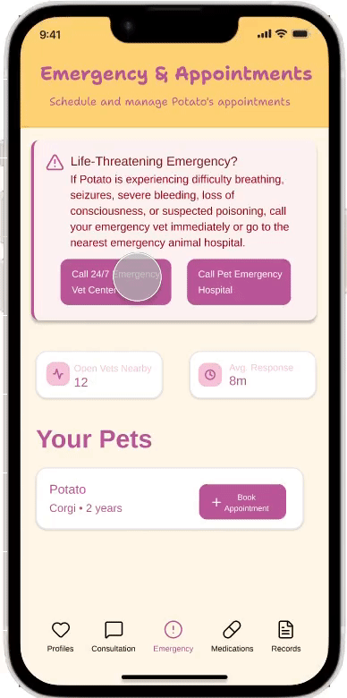
Opportunity B: Break Down “Service Barriers”
Deeply integrate hospital details, physician credentials, and real-time appointment booking. Innovation: Introduce algorithmic recommendations to push “optimal solutions” directly to users during emergencies, eliminating the need to sift through vast review volumes.
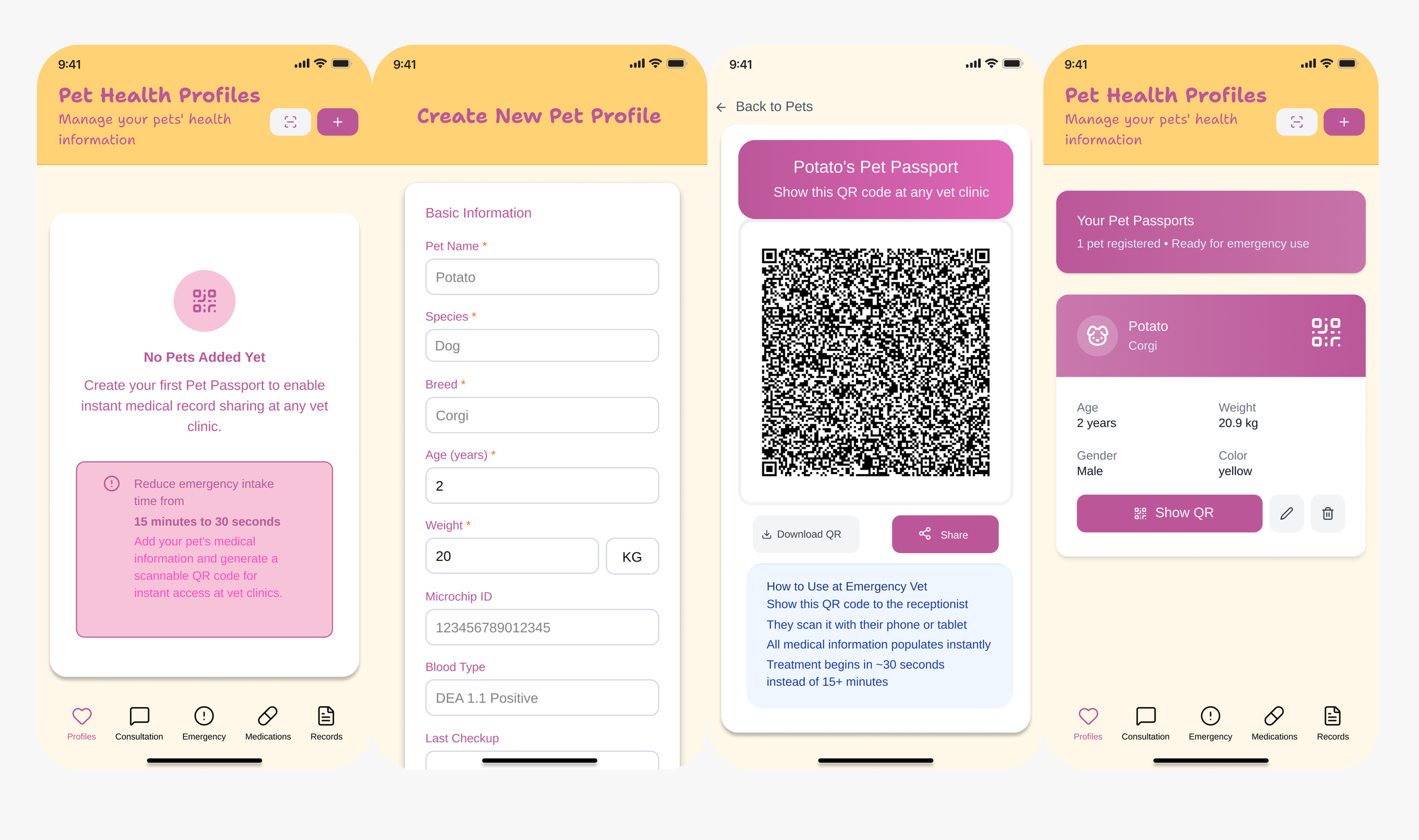
Opportunity C: Create a “Health Passport”
Transform fragmented medical histories into shareable health QR codes. Functional benefit: Enables offline veterinarians to instantly access pet histories, reducing redundant tests and saving critical treatment time.
Ideation
If we skip the conceptual phase, we're merely patching existing fragments (like adding an appointment button to a map). But through conceptualization, we're reshaping an entire ecosystem (making appointments automatically trigger transportation and medical record synchronization).
I realized that great UX isn't about designing visually stunning interfaces, but about crafting a logical chain that allows users to operate “blindly” even in moments of extreme panic.
Design
Sketch solutions
User scenarios
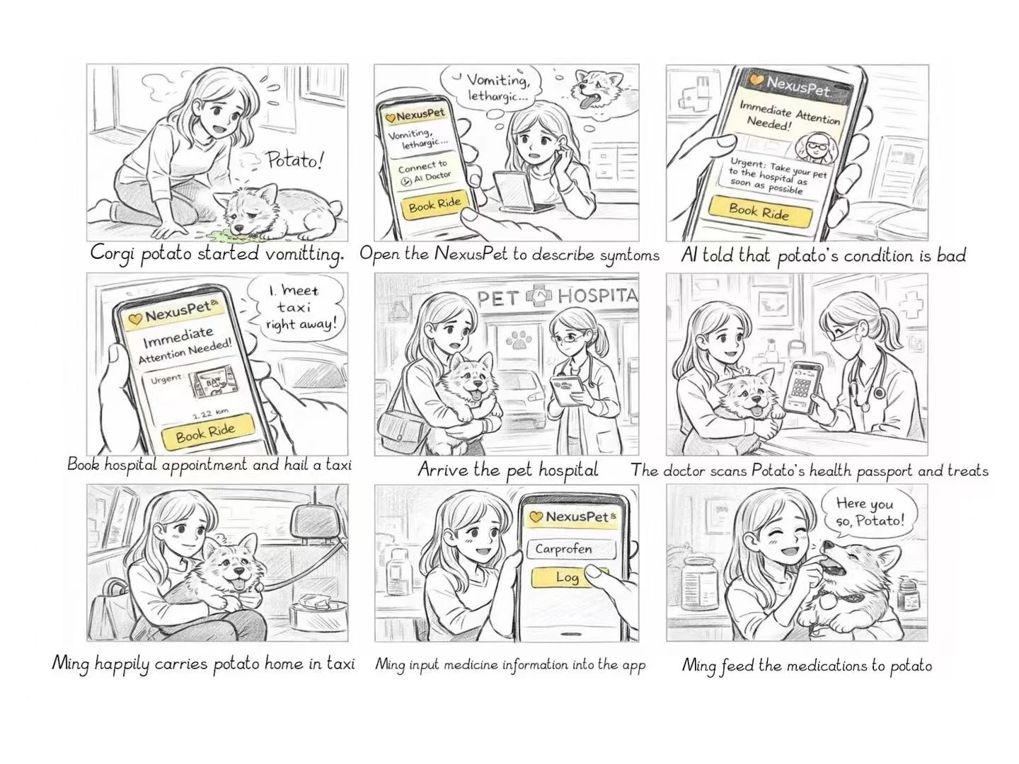
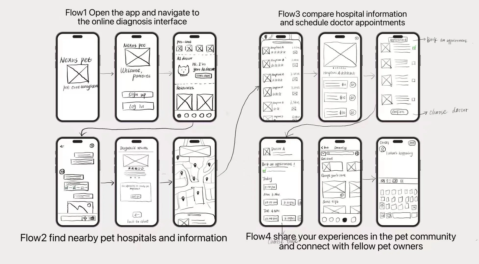
After having my most used screens sketched out and iterate on my solutions. I started on making my decisions based on different life scenarios of the persona Focusing on solving her frustrations, I asked myself “how might we” questions to decide on the user flows and final screens.
Low-fidelity prototype
Based on the decisions we made from sketched solutions, we implemented it into a lo-fi wireframe in Figma.
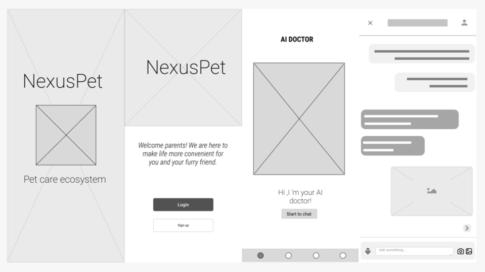
Diagnostic Interface
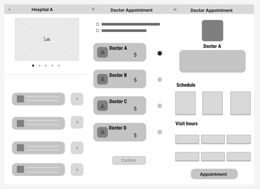
Appointment Interface
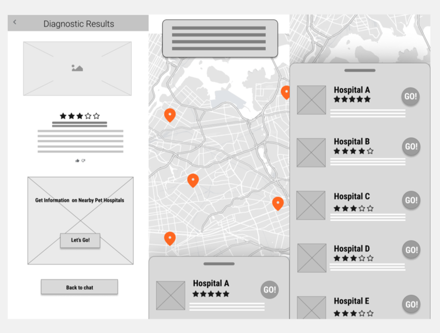
Location and Information Interface
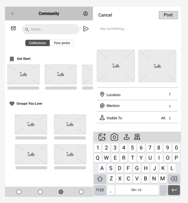
Community Interface
Conclusion
User testing
Usability Testing
In total, we did 4 remote usability tests on the hi-fi prototype. We first introduce our users to this application and its purpose. And we conducted 3 tasks for users to complete. After the testings, we went back together to share the feedback we each got. We used Miro to collect and share the feedback we received individually to mark where needs to be iterated and how users feel on each page.
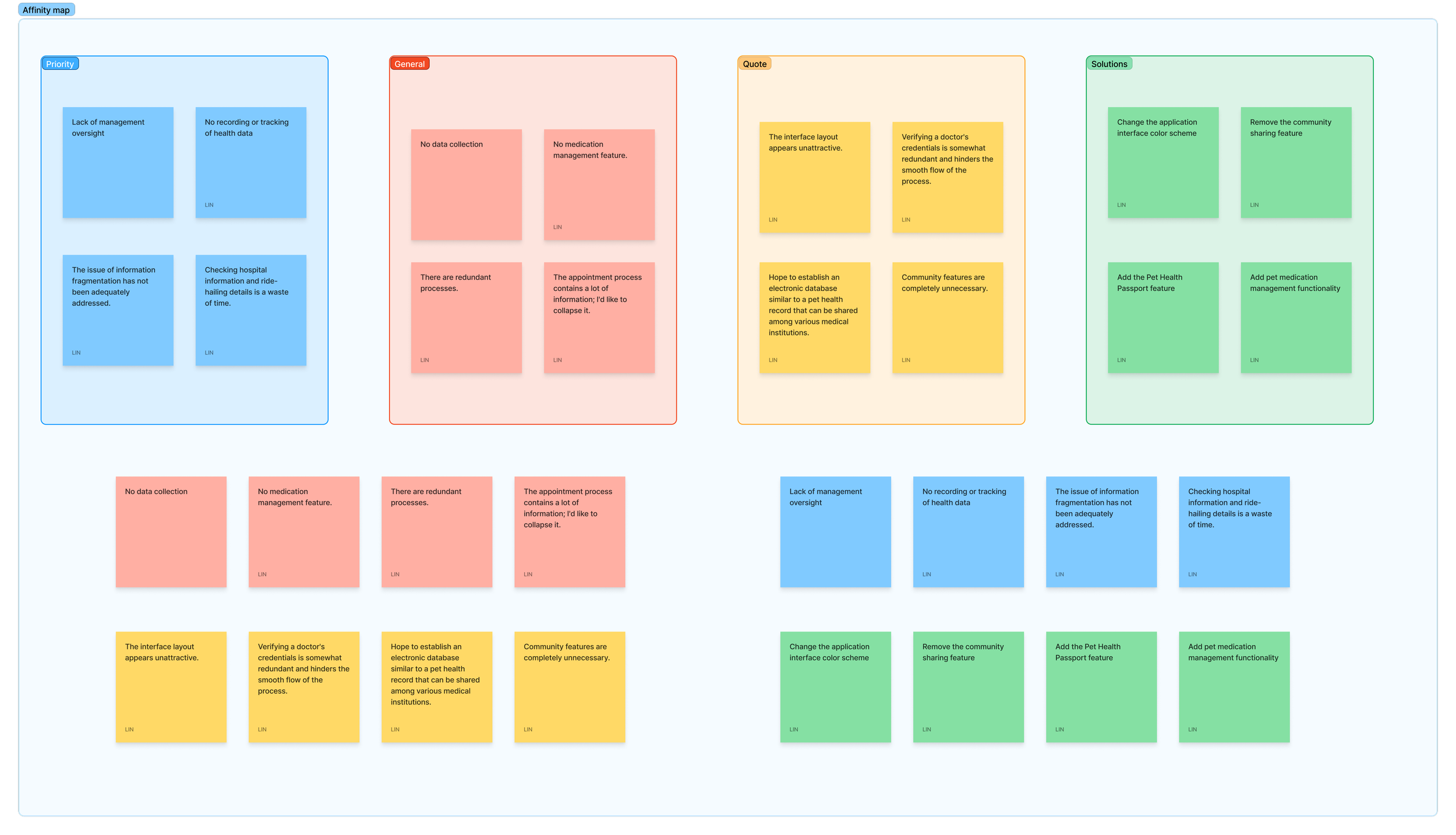
Feedback from the first round user testing
Result
1. First, add a pet health profile interface.
This interface collects pet biometric information such as name, age, weight, and medical history to generate a pet health QR code. This enables offline veterinarians to access the pet's health data, avoiding redundant examinations that waste time and reduce consultation efficiency.
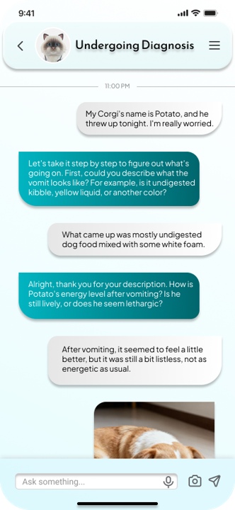
2. Users found the pre-diagnosis interface unreliable and confusing in its questioning approach, resulting in poor usability.
Version 1 required users to spontaneously describe their pet's symptoms, potentially leading to omissions that skewed diagnosis accuracy. Version 2 addressed this by introducing prompts before questioning, guiding users to provide precise descriptions and ultimately achieve accurate diagnoses.
Version2
Verson1
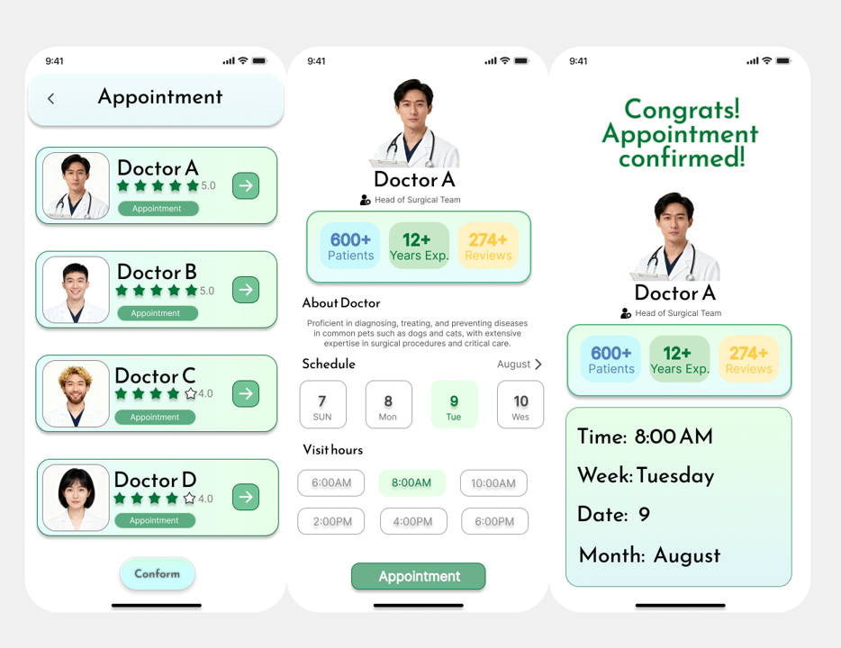
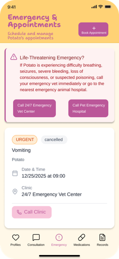
3. Users find the appointment process for veterinary clinics somewhat complicated with too many steps, hoping to secure appointments quickly. Clinic information and doctor credentials can be viewed after successful booking.
Version 1 requires users to select clinic, service, and doctor during booking, limiting efficiency. Version 2 streamlines the process by algorithmically selecting optimal options, with detailed information collapsed within the booking record for easy access.
Verson1
Version2
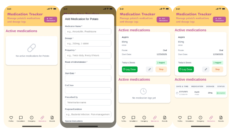
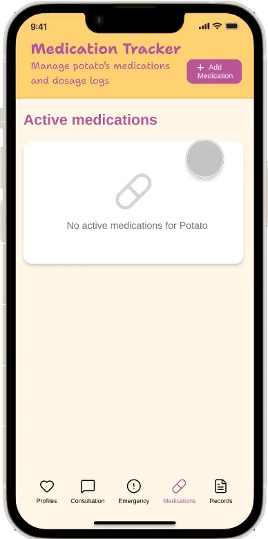
4. Users requested adding a pet medication management feature, as the types and dosages of medications for pets differ from those for humans, creating an additional memory burden for owners.
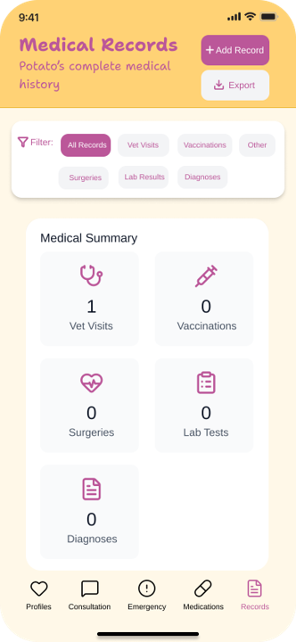
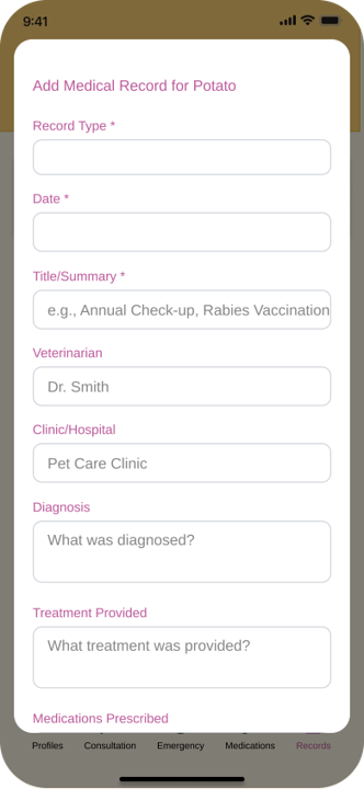
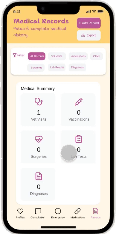
5. Added medical history tracking functionality.
This feature records each visit to the vet, including the clinic and attending veterinarian, enabling pet owners to manage their pets' health effectively and enhance their ability to respond to emergencies.
Initially, I envisioned rich features like social networking and e-commerce. However, through logical deduction, I ultimately decided to eliminate or minimize them.
Why? Because in the face of a pet health crisis, “redundant information” itself becomes a disaster.
I learned the principle of “Ockham's Razor” in UX design—in urgent medical situations, restraint in functionality is the greatest respect for life.
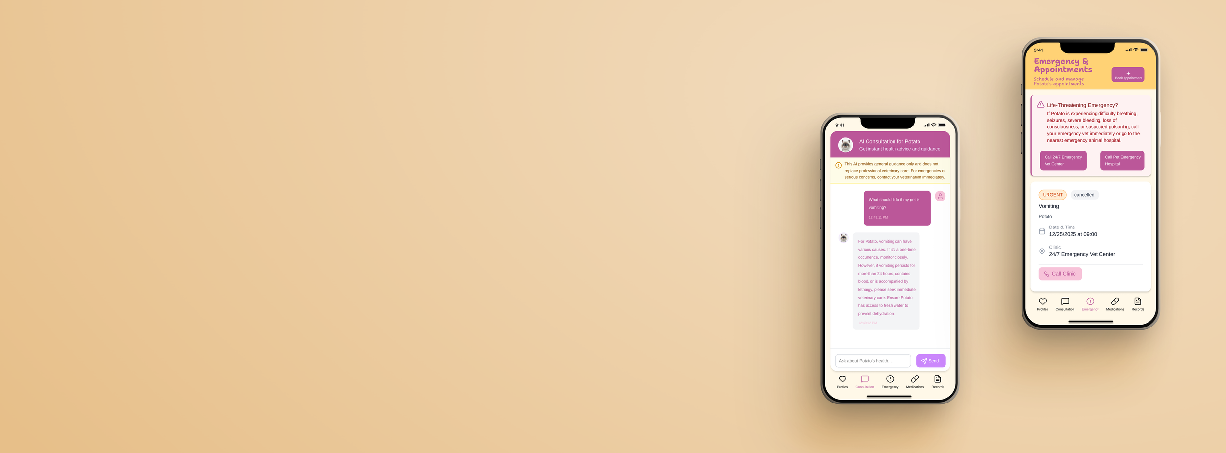
Final hi-fi prototype
Based on feedback collected from the first version of the high-fidelity wireframes, we incorporated user experiences and suggestions into the final high-fidelity prototype design.
Flow1
Enter information to create a pet health QR code (pet health passport)
Flow2
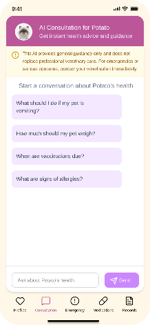
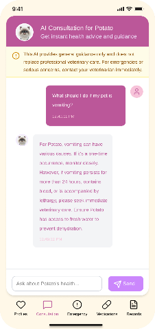
Consult AI for preliminary diagnosis
Flow3
Schedule an appointment at the veterinary hospital
Flow4
Add pet medication and record the time of administration.
Flow5
Record medical history
After multiple iterations, the final usability testing not only validated the functionality but also confirmed the effectiveness of “anxiety relief.”
I discovered that the most frequently mentioned word by users during testing wasn't “fast,” but “reassuring.” This proves that the guided pre-diagnosis and one-click scheduling services we incorporated into the design truly hit the psychological comfort zone users seek under extreme pressure.
Analysis of the operational paths from Flow 1 to Flow 5 revealed that the number of clicks required to complete a hospital appointment in an emergency situation decreased from 12 to 4, with the task success rate rising to 95%.
The pinnacle of interaction design isn't about increasing presence, but about becoming “invisible.” When users are panicking, the smoothest path is one where they don't even feel like they're “operating software.”
Takeaways
This project is the one I've poured the most passion into, because I'm a pet owner myself. Having raised both cats and dogs and experienced numerous instances of my pets falling ill, I can empathize with users' language and emotions during interviews and surveys through shared identity. Free from bias, we're simply striving toward one goal: ensuring our furry friends live better, healthier lives and stay by our sides longer.
While this project concludes, our journey into pet health is just beginning.
What I will explore next is:
Data-Driven Precision Alerts.
Leveraging breed-specific data and medical histories accumulated in the “Health Passport,” future AI predictive models could proactively push preventive recommendations before high-risk periods for specific breeds (e.g., spinal issues in Corgis).
Deepening Healthcare Ecosystem Penetration.
Having addressed the “visit the vet” challenge, the next step is standardizing “post-treatment care.” Utilizing Flow 4's medication management module, establish a remote follow-up mechanism integrated with veterinarians.
The ultimate goal is: evolving Nexus Pet from a “first-aid kit” into a “lifecycle health steward.”